GOVA rebrand
creative thesis assignment
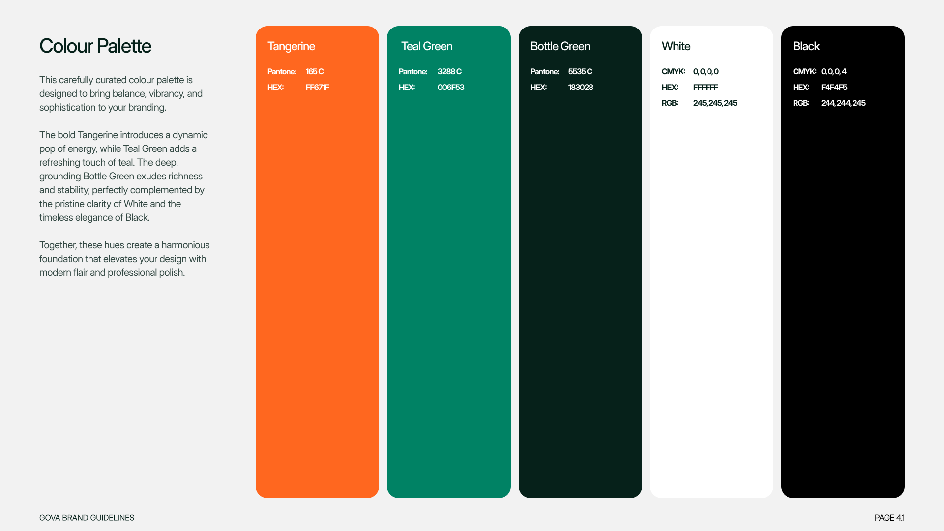
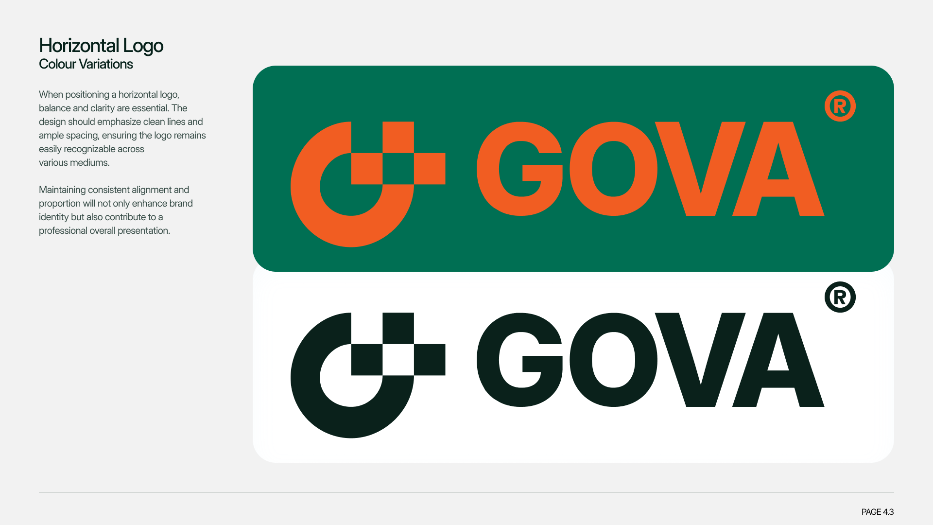
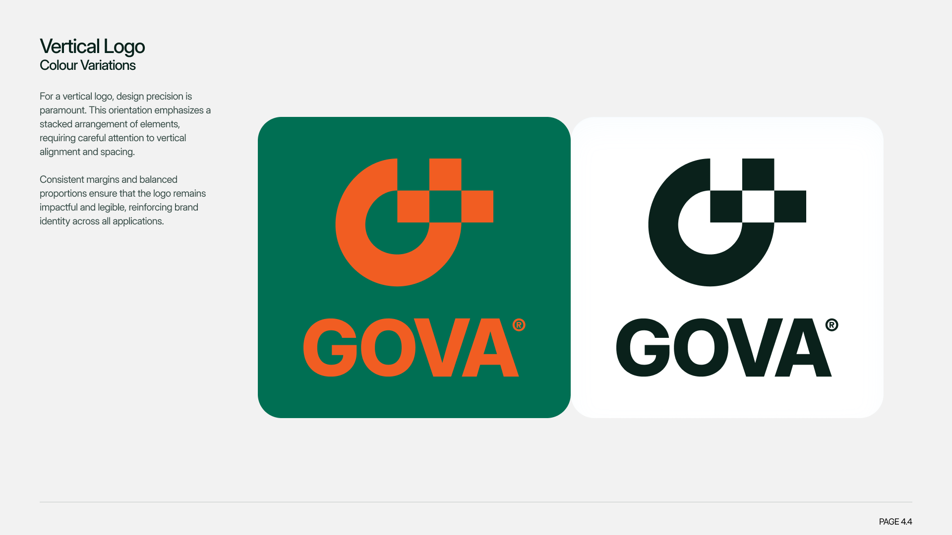
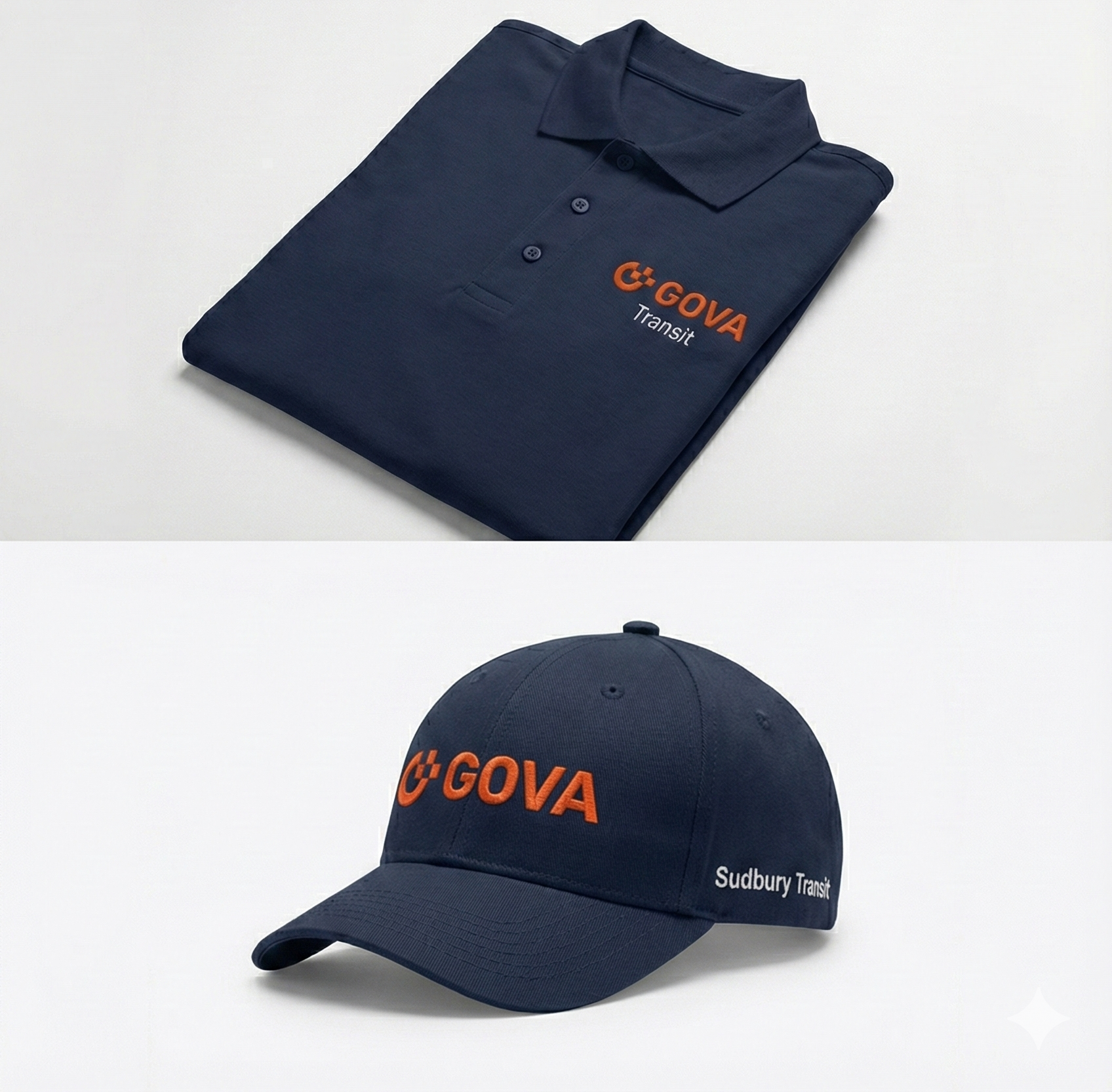
The rebrand centers on orange to symbolize energy, reliability, and a revitalized transit identity.
The logomark’s “G” is crafted as a journey: a bold starting point curves into an open arc, visually capturing movement from origin to destination. Clean, bold typography ensures clarity across routes, schedules, and bilingual materials, reducing confusion for riders.
High-contrast visuals and minimalist layouts prioritize accessibility for seniors, newcomers, and daily commuters. Together, these elements modernize GOVA as a cohesive system, emphasizing seamless connectivity and trust for Sudbury’s evolving community.


↓ Check Out The Full Project ↓